Kirkland: A Revived Mid-Century Hub
written by Melissa Dalton
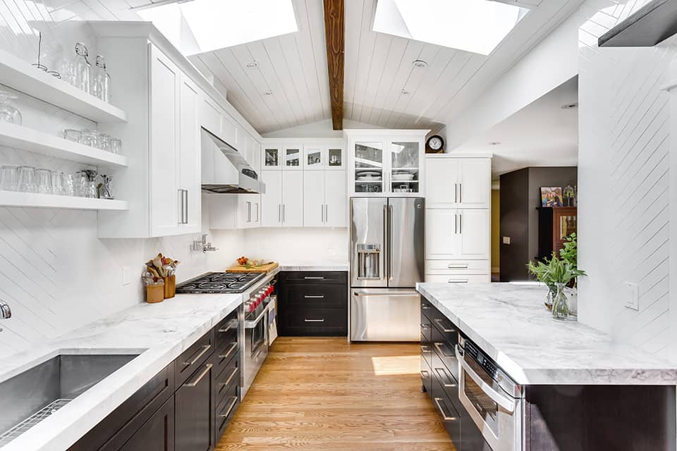
Harmony Weihs lived with the defunct kitchen in her 1960s rambler for four years. In that span, she had plenty of time to assess the room’s faults. Her list was long. The cabinet doors were falling off, sub-8-foot ceilings made the already small footprint feel more cramped and dark, and the outdated electric cooktop took fifteen minutes to heat up. “Not boil, warm,” Weihs emphasized. The final straw, though? Since the upper cabinets hovered a mere 17 inches over that cooktop, it was a tight squeeze to oversee the burners. “I couldn’t even scoop soup with a ladle without hitting the underside of the hood vent,” Weihs said. “I wanted more space, more height, and more light.” In 2014, the lead designer and owner of Design Harmony initiated a top-to-bottom kitchen renovation in her own home.
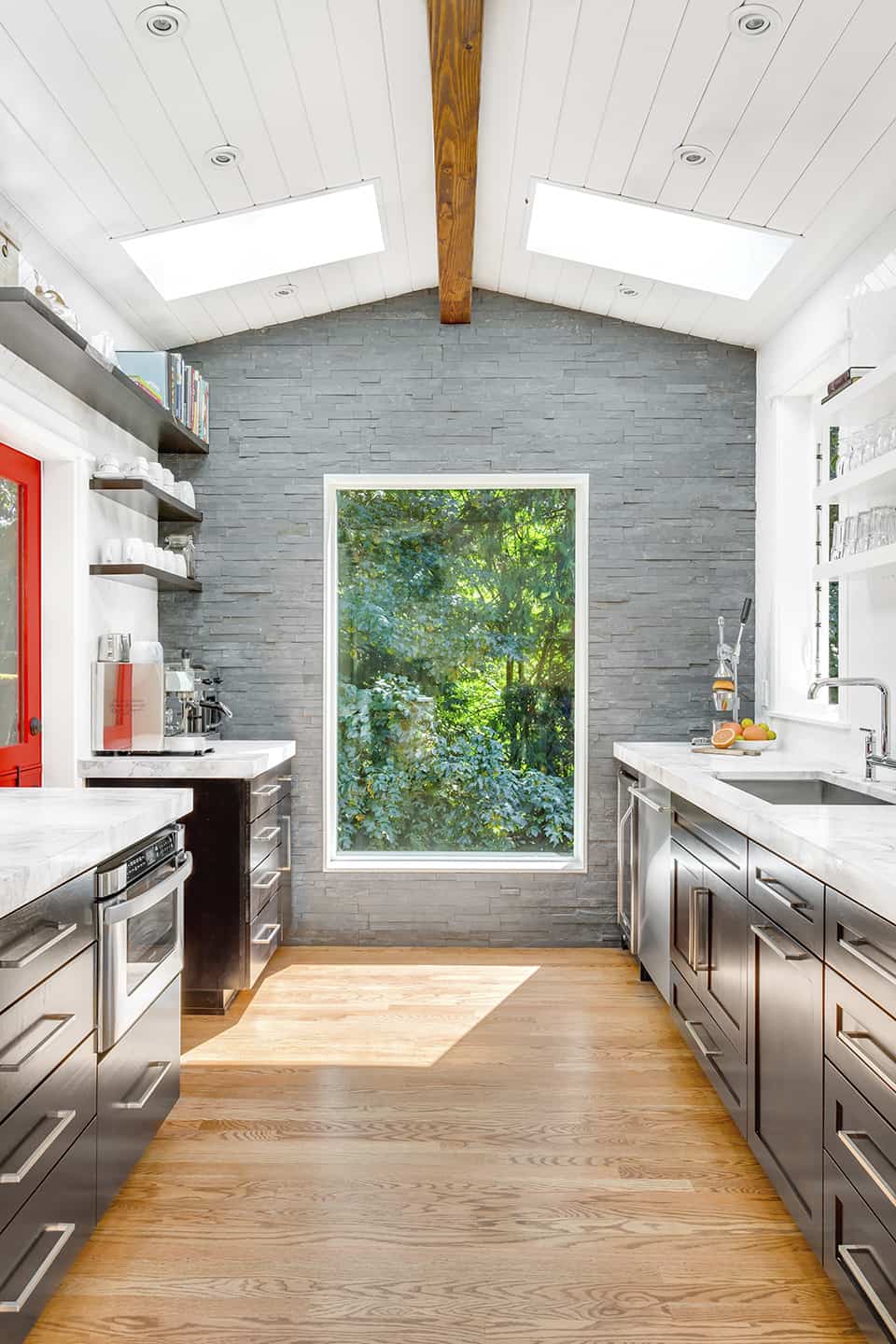
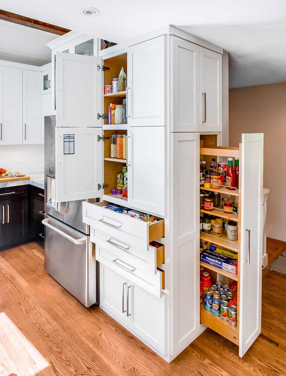
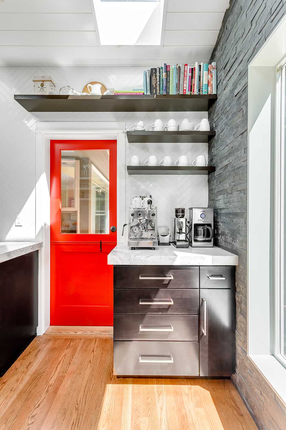
Her approach was threefold: after gutting the room, she added a 100-square-foot addition, vaulted the ceilings to 11 feet at their peak, and integrated four skylights. “I needed bigger and brighter without adding a ton of square-footage,” she said. Next, she zoned enough space for the essential kitchen functions, then designated spots for everyone who wasn’t the cook. “Function in the kitchen is number one,” she said. “It doesn’t matter how it looks if it doesn’t work day to day.” Now, a separate coffee station keeps the caffeine-deprived out of the breakfast-maker’s way, while a floor-to-ceiling pantry has lower drawers accessible to kids looking for afterschool snacks. New seating at the peninsula lets guests visit as dinner is being prepped.
The Kitchen Palette
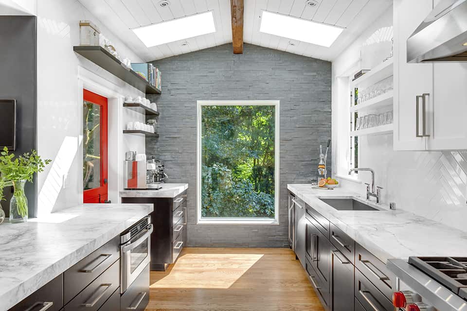
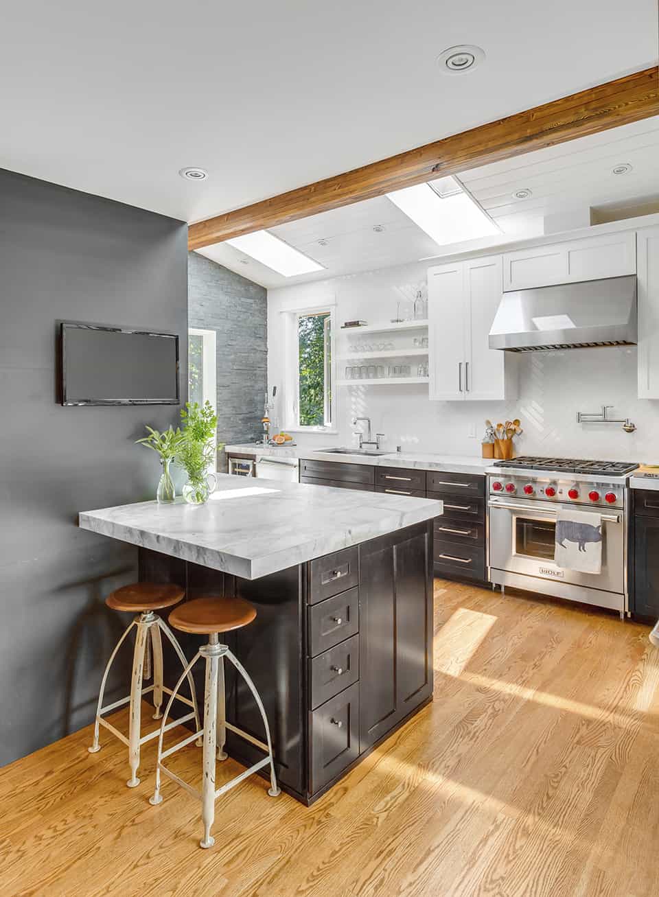

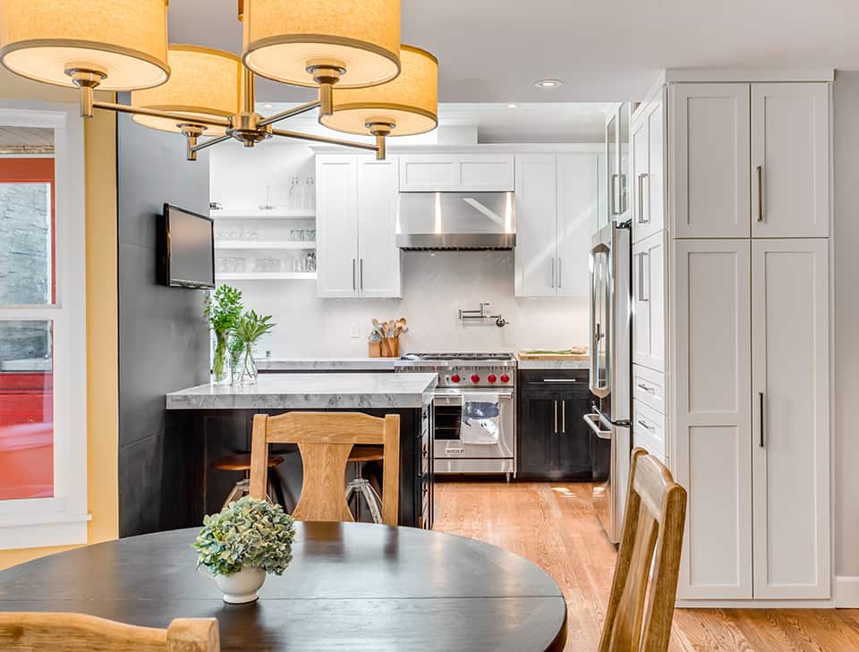

For the palette, Weihs selected a neutral scheme of black, white, and grey, then layered in texture for warmth and visual interest. “Having taller ceilings and being in the Pacific Northwest, I didn’t want a cold kitchen,” she said. To that end, oak floors flow underfoot, tongue and groove paneling clads the ceiling, and an accent wall is covered in tumbled slate. Its charcoal tones underscore the veining in the adjoining quartzite countertop. The remaining walls are enveloped with oversized white tiles set in a herringbone pattern. “I don’t like drywall,” Weihs said. By matching the grout to the tile color, she ensured the tile application would be more textural and not compete with the room’s other elements. A Dutch door painted a bright cherry red is the finishing touch.
By project’s end, undertaking such a complete transformation was a heady learning experience for the designer, who came to her profession from the apparel design industry six years ago. “I learned to be flexible in the design and to let it evolve as it comes to life,” she said. And while finally having a functional space to cook is enough reason to rejoice, it’s also fun to see how certain details reveal themselves over time, such as the oversized window which overlooks a nearby greenbelt. It has become a picturesque focal point in the new space as it captures the changing seasons. Said Weihs: “It’s like a piece of artwork.”